welcome to Spotify
I was wondering: what music am I listening to? I know I like some Italian indie or old Rock, but can I say something more? Can I, maybe, quantify, what I listen to?
Then I discovered that for every song on Spotify some features are calculated. These goes from very basic tempo (in beats per minute, BPM), loudness (in decibel, dB), or popularity to some more refined, such as energy or danceability. And all of this information can be obtained through their API! (for a more detailed list of features, check their website)
To access the API I used the R package spotifyR and multiple super useful examples (this or this)
Without further ado,
it’s data time!
For now I focused on my favorite playlist, in particular I have:
-
vibe: random songs I like
-
bop: instrumental music with high energy
-
chill: instumental music with lower tempo
to have a good representation of the whole space of music, I decided to add a playlist created by spotify that contains a song for each of the genres they consider (more or less 6000 tracks)
- everything: well, everything
Here a snippet of the code to access the song information of the vibe playlist
library(spotifyr)
library(tidyverse)


Sys.setenv(SPOTIFY_CLIENT_ID = <spotify.api.id>)
Sys.setenv(SPOTIFY_CLIENT_SECRET = <spotify.api.secret>)


access_token <- get_spotify_access_token()

vibe_id <- "4CK8ShIzzCG0CpErA8LnQA"

vibe_info <- get_playlist_audio_features(
	playlist_uris = vibe_id,
 	authorization = access_token) %>%
  add_column(name = "vibe")
(for the aesthetic I am using MetBrewer and thematic with Rstudio dark mode)
library(MetBrewer)
palette <- met.brewer("Egypt", 4)

library(thematic)
thematic_on()
Now, let’s start with some exploratory plot!
First of all, let’s see tempo, just to make sure that the idea behind my playlists makes sense.
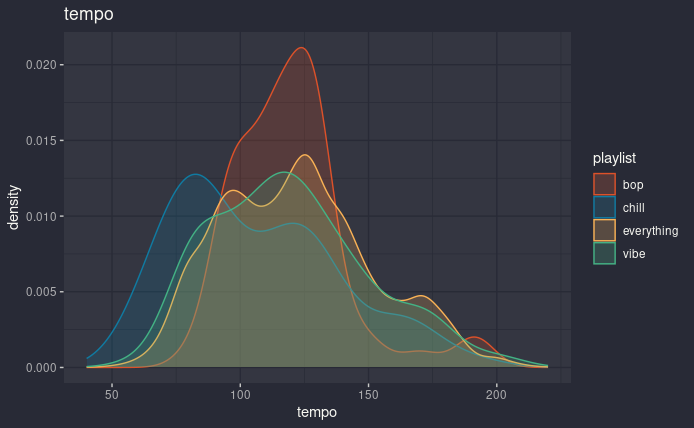
tempo distribution, one color for each playlist
Well, chill is lower than the other three, which are all more or less around 100 and something BPM. It’s just curious to see the two peaks in eveything, who knows what they might represent.
Now, let’s try with one of the spotify features: energy, which on their website is described as
“Energy is a measure from 0.0 to 1.0 and represents a perceptual measure of intensity and activity. Typically, energetic tracks feel fast, loud, and noisy. For example, death metal has high energy, while a Bach prelude scores low on the scale.”
If I am understanding it correctly, we should clearly be albe to see a difference between my playlist, at least for chill.
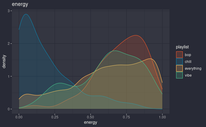
energy distribution, one color for each playlist
And yes, big difference. As expected bop is very skewed to the right, while everything is well spread out (even if it’s enriched in higher value). What is surprising is the two peaks in vibe, which maybe could be caused by the fact that the songs I like are fast paced and energetic or slow and sad, without much of a middle-ground. In the future I’ll need to come back to this…
Now to summarize all the features of my playlist, I have used a radar chart (reference), which is not the most understandable plot, but in this case it gets the job done. Here I show the mean of the features, which probably in general is not the best idea, because many of these distributions are not simmetric, but until next time it will work. >_<
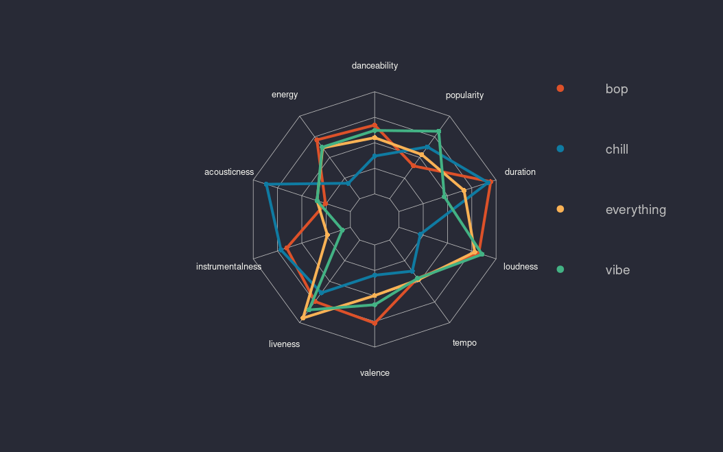
playlist summary, one color for each playlist
Checking each feature one by one is fun, but I would love to have a more general understanding of my playlists. For example, how would the songs cluster together?
dendrogram
Let’s start with a dendrogram (reference). I used only my three playlists and each color represent a playlist in the same way of the previous plots.
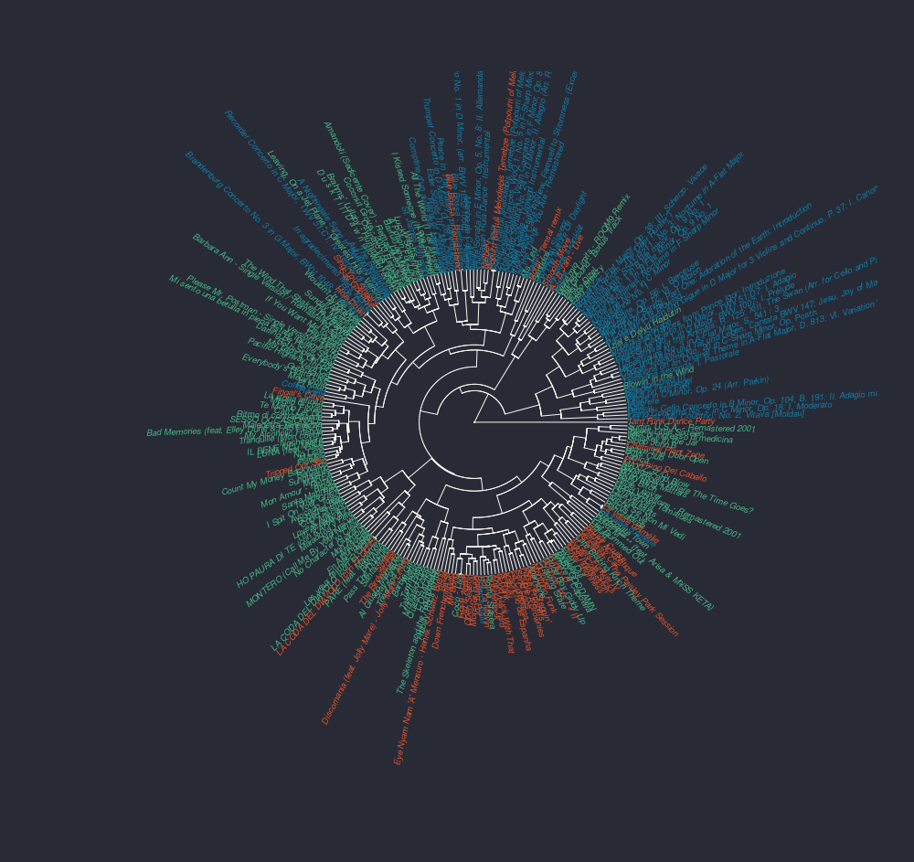
dendrogram of songs from bop (red), chill (blue) and vibe (green)
Mmmhh, pretty. Maybe let’s remove the names of the songs.
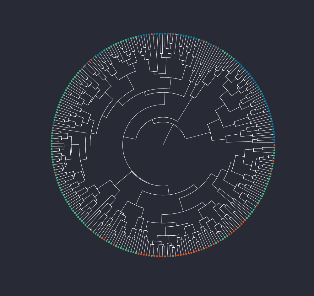
dendrogram of songs from bop (red), chill (blue) and vibe (green)
Now that’s better. From a very qualitative point of view, I am satisfied that bop songs (red) and chill (blue) seems to be more or less together, with vibe all around the place. I am just curious about that single bop song all alone on the right, so far away from everything else. Luckily I can easily find the title from the not scary at all plot of before eheh.
And it’s “1am Funk Dance Party”! This songs doesn’t look particularly different from the others, but it’s 22 minute long, and since the duration is one of the feature I am considering for the clustering, it makes sense that it’s very different from the others (even if I scale the data to do the dendrogram).
Well, removing the duration is not changing the dendrogram that much, at least at first sight.
heatmap
So, clearly the next step is a heatmap, because everybody loves a good heatmap (reference and reference two because I didn’t like a square). I have done some normalization because tempo and loudness kept messing with me because their ranges were way bigger than the others, which are usually between 0 and 1.
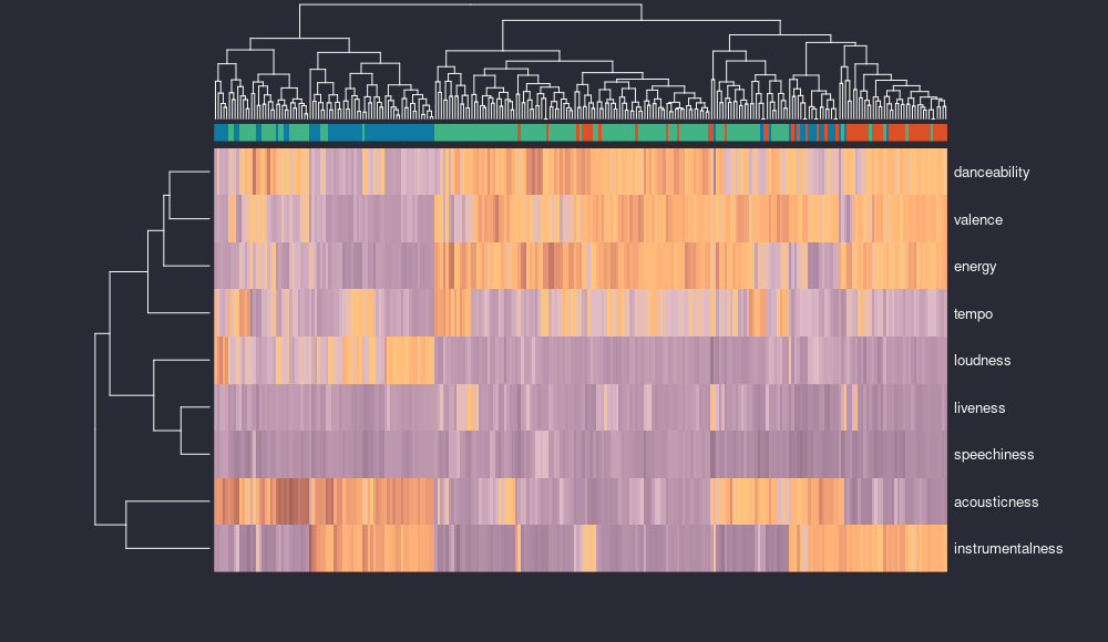
heatmap of songs from bop (red), chill (blue) and vibe (green)
It seems that there are features more closely related to each other, like danceability, valence and energy, or liveness and speechiness. This is particularly interesting, because maybe the presence of an audience and the presence of words go together, but maybe it’s simply because both are very low in all my songs. On the other side, acousticness and instrumentalness are on their own.
pca
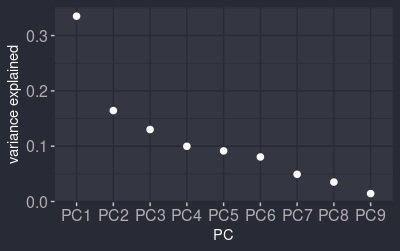
variance explained by the different principal components
Let’s continue with a principal component analysis (PCA) and see if some of these relationships are maintained. For this I used the everything playlist ecause I would love to see the whole space of songs, not just the little subsets of the one I like. Now, the variance is mostly explained by the first component, but then it decreases smoothly, maybe the last three are the only one that could be ignored, but who knows.
(the component representation was done using the ggfortify package)
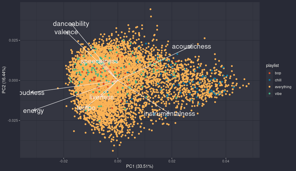
pca: pc2 - pc1
The first component summarize clearly the range acoustic/instrumental music vs other songs, in fact all the songs from chill are clearly on the right. The second component seems to be about the contrast between happy and danceable songs (high valence and danceability) and songs that are higher tempo and energy, but it’s not so clear.
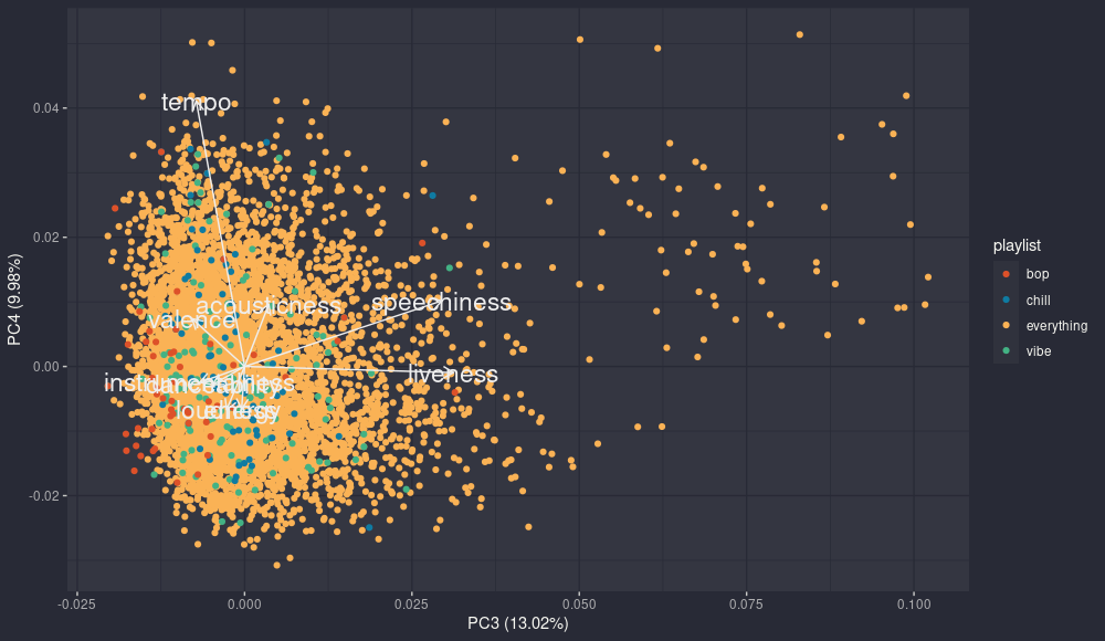
pca: pc4 - pc3
Looking at pc3 and pc4 adds some information, in particular the third component shows again the relationship we saw before between liveness and speechiness. The curious thing is that in this case there are plenty of tracks from everything with very high values in both. A quick check and well, they are not songs. They are readings of books or stand up performances, which would explain both the incredible levels of speechiness and audience partecipation. And this could explain why they kinda go together, even if in the second component they have opposite sign.
That is all for now, it was fun to explore a bit my playlists. In the future, it would be fun to continue, maybe dissecting better the relationships between features or the reccomendation algorithms. If you are interested in this topic I really suggest this very intereting video. At the moment I have in mind to understand the shuffling algorithm, is it actually random? I don’t know yet, but we wil see. :)