italy
introduction
One day I was discussing with friends about a proper definition of Northern, Center and Souther Italy. Should it be based on historical and cultural considerations? For sure! So let’s ignore all of these and move onto something that is easier to get eheh. What if we define the three regions as a subdivision of Italy that split the population exactly in three along the North-South axis?
There are probably a lot of good reasons why this doesn’t make any sense for any actual classification, but the idea kept twirling in my mind and finally I worked on that!
First of all, a huge thanks to this extremely useful resource. It’s updated to 2018, but still, without it I would have never even tried this project.
It offers a lot of useful informations, I am going to focus on the population of every municipality, it’s latitude and longitude. I have additional information such as the names (which I am using for some clearer visualization), but I haven’t touched many others info, like province, surface area, saint and many more. For simplicity I assumed that the population of each municipality is concentrated in the center (the coordinates given). It might be not very accurate on a very small scale, but I am sure that on the country scale is negligible.
So let’s start reading our data
library(tidyverse)
library(rjson)
library(tidyjson)
library(ggrepel)
library(thematic)

thematic_on()

dt_info <- fromJSON(file="data/italy_info.json", simplify=TRUE) %>%
  spread_all() %>%
  select(-"document.id")
dt_geo <- fromJSON(file="data/italy_geo.json", simplify=TRUE) %>%
  spread_all() %>%
  select(-"document.id")
dt_cities <- fromJSON(file="data/italy_cities.json", simplify=TRUE) %>%
  spread_all() %>%
  select(-"document.id")

dt <- full_join(dt_cities, dt_geo, by = c("istat", "comune")) %>%
  filter(istat != "Total") %>%
  drop_na() %>%
  mutate(across(lng, as.numeric)) %>%
  mutate(across(lat, as.numeric)) %>%
  mutate(across(num_residenti, as.numeric))
I was struggling with some of the following steps, until I discovered the municipality of Fiastra, which is a “spread municipality” (never heard of it until now), which means that their center is not defined, and so are its coordinates. Nothing that a quick drop_na() cannot fix. I hope that its 8 inhabitants are not going to mess up the rest of the code.
plot time!!
Let’s do some plots!
Let’s start with some quality of life function for later, just to draw lines and labels…
add_line_label <- function(plot, var, city, y_pos = 0.15) {
  val <- dt %>% filter(comune == city) %>% pull(get(var))
  plot +
    geom_vline(xintercept = val) +
    annotate("text", x= val - 0.4, y=y_pos, label=city, angle=90)
}
Ok, now let’s start for real. Let’s look at the density of population along the South-North axis
lat_density_plot <- dt %>%
  ggplot(aes(x = lat)) +
  geom_density(color = NA, fill = "#660022", alpha = 0.6) +
  ylab("population density") +
  xlab("latitude") +
  scale_x_continuous(breaks = round(seq(min(dt$lng), max(dt$lng), by = 1),1))
lat_density_plot <- add_line_label(lat_density_plot, "lat", "Milano")
lat_density_plot <- add_line_label(lat_density_plot, "lat", "Roma")
lat_density_plot <- add_line_label(lat_density_plot, "lat", "Napoli")
lat_density_plot <- add_line_label(lat_density_plot, "lat", "Palermo")

lat_density_plot

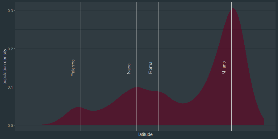
I put down some cities latitudes as a reference point to understand better the plot.
It’s not very unexpected that there is a huge peak in the population density in the North and some minor peaks closer to the bigger cities.
lng_density_plot <- dt %>%
  ggplot(aes(x = lng)) +
  geom_density(color = NA, fill = "#006655", alpha = 0.6) +
  ylab("population density") +
  xlab("longitude") +
  scale_x_continuous(breaks = round(seq(min(dt$lng), max(dt$lng), by = 1),1))
lng_density_plot <- add_line_label(lng_density_plot, "lng", "Milano")
lng_density_plot <- add_line_label(lng_density_plot, "lng", "Roma")
lng_density_plot <- add_line_label(lng_density_plot, "lng", "Napoli")

lng_density_plot

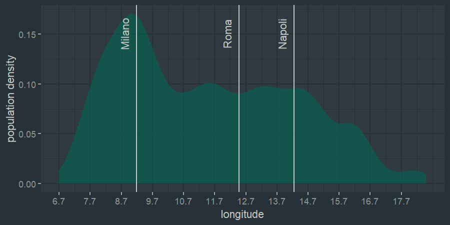
In the langitude plot the peak associated with Milan is still clear, but the rest is less clear with no clear peaks.
Now it’s time to move to the main course, the reason why we are here. I am going to plot the cumulative population curve along the latitude (integral of the density over latitude plot). I left the same cities as a reference, and we can see that where we had peaks before now we have steeper parts of the plot.
pop_curve_pop <- map_int(dt$lat, ~sum((dt$num_residenti[dt$lat<=.x])))
pop_curve_lat <- map_dbl(dt$lat, ~.x)

pop_curve <- tibble(lat = pop_curve_lat, pop = pop_curve_pop)

pop_curve_plot <- pop_curve %>%
  ggplot() +
  geom_area(aes(x = lat, y = pop), fill = "#660022") +
  geom_hline(aes(yintercept = sum(dt$num_residenti) /3)) +
  geom_hline(aes(yintercept = sum(dt$num_residenti) /3*2)) +
  ylab("population integral") +
  scale_x_continuous(breaks = scales::pretty_breaks(n = 40), guide = guide_axis(angle = 90))

pop_curve_plot <- add_line_label(pop_curve_plot, "lat", "Milano", y_pos = 0.87*max(pop_curve$pop))
pop_curve_plot <- add_line_label(pop_curve_plot, "lat", "Roma", y_pos = 0.87*max(pop_curve$pop))
pop_curve_plot <- add_line_label(pop_curve_plot, "lat", "Napoli", y_pos = 0.87*max(pop_curve$pop))
pop_curve_plot <- add_line_label(pop_curve_plot, "lat", "Palermo", y_pos = 0.87*max(pop_curve$pop))

pop_curve_plot
In addition I added two horizontal lines respectively at 1/3 and 2/3 of the total population. The latitudes of where these lines intersect the plot are the values we were looking for. Already we can see that more or less the two lines are a bit souther thatn Rome and Milan.
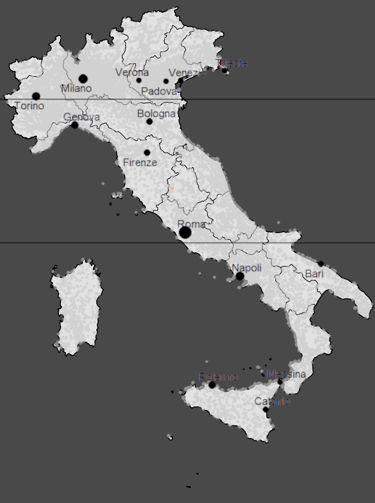
This is not the clearest visualizatios, so I plotted on a map of Italy.
This was trickier than expected, because all my coordinates for now are in latitude and longitude, which I cannot use directly to plot my dots on the map, which is some kind of projection.
I used these useful formulas and wrote some code to obtain all my coordinates into the projection reference system.
degreesToRadians <- function(degrees) {
  (degrees * pi) / 180
}

lngToX <- function(lng) {
  degreesToRadians(lng + FE) * R
}

latToY <- function(lat) {
  R * log(tan(pi / 4 + degreesToRadians(lat) / 2))
}

# east reference
FE <-  180
R <- 6378
dt <- dt %>%
  mutate(x = lngToX(lng)) %>%
  mutate(y = latToY(lat))
and a bit of Gimp later…

tadah!!!
I guess that for a very specific (and completely unreasonable) definition of Northern, Center and Southern Italy, Center Italy starts immediately south of Turin and Souther Italy starts below Rome. Maybe half of Piedmont could disagree with the fact that they belong in Center Italy, but this is something to think about for the future eheh.
Ah, I was forgetting, in pink it’s the weighted center of Italy based on population. Is it useful? Who knows ahah
(I know, towns are not perfectly aligned with the edges of the map. I am not sure if it’s a problem with my projection or simply a problem of the manual alignment with the region borders)